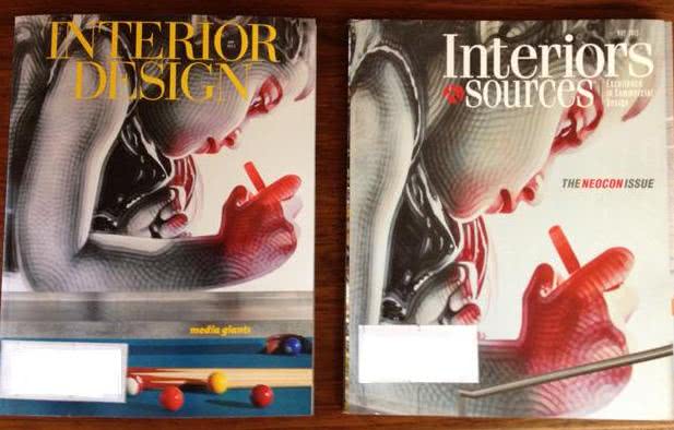
Two Covers, Too Close for Comfort
We receive hundreds of magazines in our offices each month. That’s no exaggeration. When thousands of print and digital publications are published each month, there are bound to be creative similarities at times. (There are no new ideas, right?)
But the covers of Interior Design and Interiors & Sources are a little too close for comfort: They both depict the spray-painted mural by El Mac in Adobe’s new corporate campus in Utah.
A coincidence? Uh, no. I don’t believe in coincidenc es, and it’s certainly no accident this time, according to “sources.” (But I’ll let that topic go.)
Interiors & Sources beat Interior Design to the punch by publishing this cover first. So why didn’t the Interior Design team see the other cover and change its plans? This may cause some confusion when both issues appear at the NeoCon show in Chicago. Attendees and subscribers may make the mistake of thinking they’re the same magazine.
Common themes or ideas can sometimes result in common thinking, even from different design teams. Read this blog on how a few national magazines developed very similar covers for their fall 2012 issues: http://goo.gl/8Mxby
This is a trap that all types of designers–architects, kitchen designers, ad agencies and others–can easily fall into. Or fall victim to.
There are a lot of copycats who are satisfied ripping off others’ ideas and passing them off as their own, and it’s easy to become lazy and go with the obvious design. Being an IKEA hacker is fine for the budget-minded DIY crowd, but not for a designer intent on blazing her own trail. Designers love to see other designers’ work. Ethical professionals will use those sneak peeks as inspiration, not as prepared blueprints.
Designers often strive for a signature look or original designs that will set them apart from others. In an age when competition is fierce for new ideas, new images, new content of all types, delivering an original concept can be difficult, though.
Where do you draw the line in creating designs from others’ work? What do you do when someone “borrows” your design? And more importantly, how do you protect your professional image when your “original” images are up for grabs?
When there’s no differentiation between your work and someone else’s, you’re reduced to competing on levels that have nothing to do with creativity.