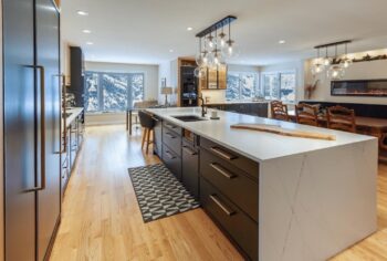
Showcase of Stunning New Kitchen Designs from the 2024 KCMA Design Awards
The Kitchen Cabinet Manufacturers Association (KCMA), an organization that champions advocacy, leadership, and quality in the North American cabinet industry, recently held their first KCMA® Design Awards program and invited some of America’s top interior designers to participate. The 2024 competition, which announced winners in April, recognized outstanding kitchen designs by interior designers, kitchen designers, and architects practicing in the United States.
The contest accepted submissions from fourteen professionals using KCMA member cabinets. Entries were judged by a panel of six all-star judges on seven separate categories: Innovation, Aesthetics, Functionality, Durability, Utility, Emotional Quotient (EQ) and an Overall Rating. First, second, and third place winners were selected from a slate of breathtaking projects. To learn more about the distinguished panel of judges, click here.
Below, we’ll showcase some of these gorgeous and innovative renovation projects and detail the role that KCMA member cabinets played in creating functional and beautiful spaces, with the designers describing their vision in their own words. The contest featured a wide variety of design themes, colors, and use cases. Tying everything together for each project were cabinets that received KCMA’s ECP or A161.1 certification, the highest standards for quality in the industry.
For full details on each project, as well as additional projects considered in the contest from the fourteen designers below, view KCMA’s Look Book here.
First Place Winner: Natalia Pierce, CMKBD of Detail by Design in Ontario
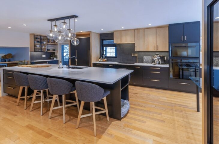
Pierce remodeled an outdated and cramped kitchen with cabinets from Cuisine Ideal in black and natural wood to fit a sleek and contemporary theme. The transformation that this space underwent due to Pierce’s keen eye for detail led the judges to declare this project the winner.
Pierce: “The goal of this space was to open up all the walls between the kitchen, dining room and a small nook behind the kitchen where the client was using this space as a small office. The open space would allow for much more natural light to enter the kitchen and improve functionality…The design layout was planned to ensure the optimal flow of how our client functions.
Every cabinet was organized for ideal storage locations for tools and appliances. Drawer organization, pull-out pantries, vertical dividers, roll-outs, and a pot filler – not only near the cooktop but accessible to the coffee machine, were all selected to maximize functionality. The selection of accent finishes in the faucet and hardware were carefully chosen to add a knurled texture with black and gold accents to tie the whole design together.”
Judges’ Commentary
“Bold and wonderful transformation of the old to the new. Large open floor plan with lots of natural light compliments the darker finishes of the cabinets.” – Sharon L. Sherman
“The before and after is remarkable… it appears to be a completely different home! I love everything about this kitchen. The combination of color strikes the perfect balance of mood without being over done.” – Lance Stratton
Second Place Winner: Cassidy Jones from Slate Creek Builders
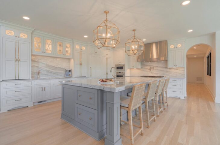
Designer Cassidy Jones had a challenge: maximizing storage space while improving layout and lighting. Through a variety of creative design decisions, and with the help of gorgeous gray and off-white cabinets from Dura Supreme cabinetry, she achieved her clients’ vision and was awarded second place from KCMA’s judges, who praised the use of materials and lighting as “magical.” Read about her process below.
Jones: “In this remodel, our goal was to address the layout and storage shortcomings, but also overhaul the kitchen’s aesthetic and finish level. The new layout had to address the lack of natural light and need for significantly more storage, but the homeowners also asked for the kitchen to be fully loaded… Thus, we also prioritized innovative solutions to appliance placement, flow and aesthetics…The hidden walk-in pantry includes a freezer column, storage and prep space.
The island, with luxury quartzite tops, contains the sink, dishwasher, hidden warming drawer, charging drawers, and more, with oversized pendant lights anchoring the room. Most importantly, it orients the kitchen toward the views in every direction-with a new window wall added in the adjacent dining room.”
Judges’ Commentary
“Magical. Just lovely. Great use of materials. Bold lighting offsets more expected style.” – Jenny Provost
“Great appliance package and hardware selections, very sophisticated.” – Amy A. Wittenbach
Third Place Winner: Michael Horton of Horton Harper Architects
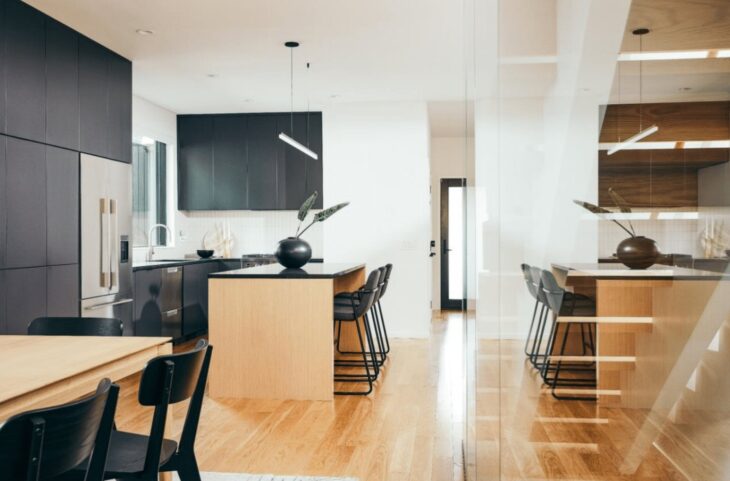
Using white surfaces contrasted with black detailing, including beautiful dark cabinets made by the Corsi Group, third place winner Michael Horton gave his clients their dream contemporary living space and emphasized the kitchen’s geometry. Read more about his vision below.
Horton: “This 3-bedroom, 3-bathroom home was designed for contemporary city living. The site is defined by its narrow 22’-0’ width and constrained by a neighboring house that nearly abuts its southern property line. Thus, the interior living space measures only 15’-0” from wall to wall. The interior is organized around a linear staircase. Glass panels veil the staircase from the ground floor, creating an ethereal interplay of light, shadow, and reflection. White surfaces are contrasted with black detailing to allow the home’s geometry to speak for itself, while white oak floors and modest pieces furniture infuse the interior with midwestern warmth.
The kitchen cabinetry contrasts the white walls with dark, flush, full overlay doors along the perimeter. The island cabinetry matches the flooring through the use of reconstituted white oak veneer. As a result, the kitchen defines the entire first floor through its expression of contemporary detailing.”
Judges’ Commentary
“Here we see the benefit of contemporary design when applied to a small space. The contrast in colors is doing all the work in making it beautiful. The design is otherwise simple and straightforward… just what is called for in a very small space. Love it!” – Lance Stratton
“Love the use of space, use of slab style dark cabinets and glass stair wall.” – Amy A. Wittenbach
Designer: Ashleigh Schroeder, NCIDQ, CKBD of Nest Kitchen, Bath and Home Design
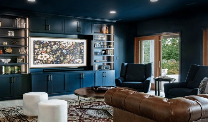
Ashleigh Schroeder delivered a moody and sophisticated basement remodel for her clients, who wanted a memorable space to entertain their guests. Beautiful blue cabinets from Hi-Lo Industries and Bridgewood Custom Cabinetry helped her create a transformative aesthetic.
Schroeder: “The homeowners desired a moody and dramatic space for hosting their guests. I worked closely with the homeowners to bring their vision to life. We selected a modern color palette of cool grays and blues, accented with warm wood tones for a cozy yet sophisticated atmosphere.
The focal point of the basement became a custom-built bar area with sleek quartz countertops and statement pendant lighting… From the selection of luxury finishes to the arrangement of decor, every element was thoughtfully curated to achieve a cohesive and inviting look. The end result was a stunning transformation that exceeded the homeowners’ expectations, providing them with a perfect setting to entertain.”
Judges’ Commentary
“Beautifully realized space which captured the moody vibe the client was looking for.” – Sharon L. Sherman
“A sexy enveloping environment created with materials and details that support the design.” – Gary Jay Paul
Designer: Peg D’Onofrio Moran
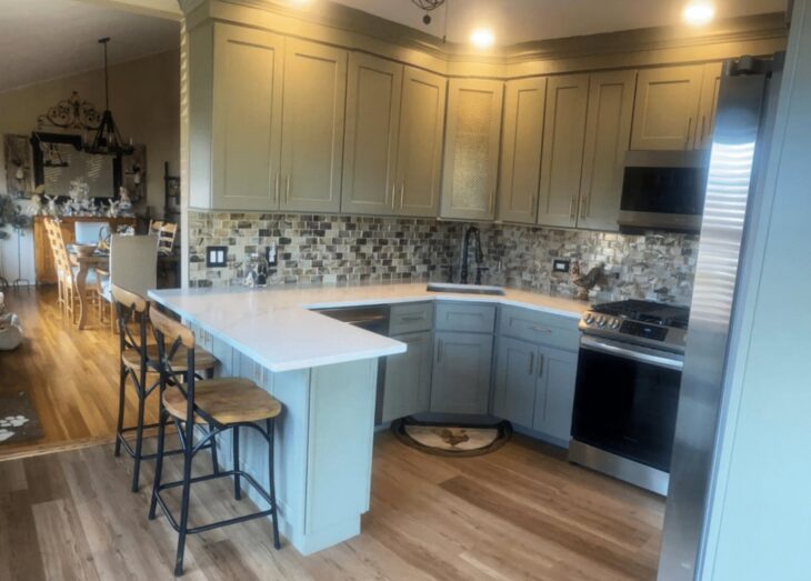
Peg D’Onofio Moran gave this small kitchen a modern revival with charming sage green cabinets from RiverRun Cabinetry. D’Onofrio Moran’s creative use of space and materials also provided her clients with additional much-needed functionality and storage.
Judges’ Commentary
“A definite improvement over the original…Well executed.” – Shea Pumarejo
“Considering the budget and the space restrictions, the designer did an amazing job to meet the client requirements and transform the space.” – Sharon L. Sherman
Designer: Ruth Ann Taylor, CMKBD, CLIPP™ of Taylored Spaces
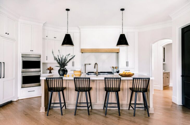
Ruth Ann Taylor’s clients desired a luxurious and contemporary space. She modernized the design of their kitchen and created a bold, classy and transitional style with the help of elegant white cabinets from Cabico, Inc, along with beautiful natural wood details and thoughtful black accent pieces.
Taylor: “This home was built in the early 2000s. Upon my first glance at this kitchen wall, I was like “there is no focal point here- where do I look?” I collaborated with a local interior designer to create a space with a true focal point of a grand, simple hood. We also integrated up-to-date colors and finishes to create the relaxed luxury environment these clients were searching for.
We replaced the dated raised panel glazed painted finishes, heavy corbels, rope trim accents on the cabinets and hardware, and in with a crisp, warm white painted inset cabinet. The island and other accents in the space are a white oak with a veiled (soft, matte) finish that is stunning to the touch. We also re-oriented and changed the overall shape of the island to elongate the look of the room. The full height quartz splash and thicker countertops on the island also add to the luxurious look.”
Judges’ Commentary
“This designer understands the power of contrast: black against white augmented by the warmth of wood. Well done!” – Jenny Provost
“Best before/after: refocused the center of the kitchen and ancillary decisions improve the concept.” – Gary Jay Paul
Designer: Tracey Stephens, CID of Tracy Stephens Interior Design
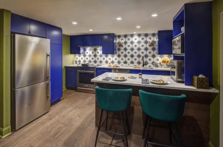
Due to radically downsizing, Stephens’ clients required a compact and efficient space that also left room for novelty and fun. With the help of bold blue cabinets from Showplace Cabinetry and some eye-catching accents, Stephens transformed a drab, cramped space into something truly enjoyable.
Stephens: “The homeowners radically downsized from a 5-bedroom house to a 1-bedroom in-law suite in a house shared with family. The only space for the new 2nd kitchen was the slab floor basement without windows and an 83” ceiling height. The design process started with these questions: how small, fun and sustainable can this kitchen be?
The compact kitchen layout is super organized, efficient and easy to use. The cabinets are loaded with smart storage…With the low ceiling and bold blue color, it was especially critical to keep the cabinet door style simple: a slimmed down shaker style to add detail but not overwhelm the small space.”
Judges’ Commentary
“Brave use of color and pattern. Makes it exciting. Great use of accessories.” – Jenny Provost
“Great transformation of a sad/left over space.” – Gary Jay Paul
Designer: Cathy Pits, CAPS of Cabinetworks
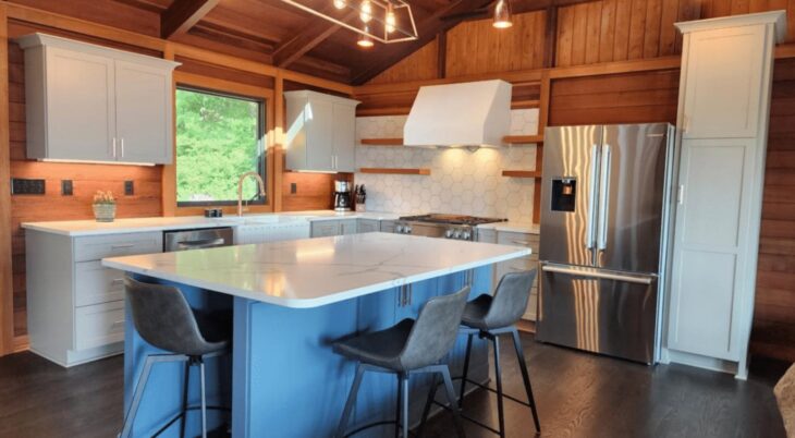
Cathy Pits gave her clients a contemporary kitchen paradise that blended harmoniously with their natural surroundings in the mountains using blue and smoky gray cabinets from MasterBuilt Cabinets and Showplace Cabinetry, paired with warm cedar and thoughtful copper accents.
Pits: “I call this home a mountain retreat…Pairing the warm reddish cedar with the more contemporary wants of the clients is what pulled the light gray cabinets and smokey blue island into the design. Copper accent hardware to tie it all in. Just beautiful!”
Judges’ Commentary
“Wonderful transformation of the space. Interesting use of materials.” – Sharon L. Sherman
“This kitchen needed you badly, and you delivered. I loved the overall look, and you addressed some difficult design challenges in thoughtful ways.” – Lance Stratton
Designer: Breezy-Tipton Gorman of Interior Image by Breezy
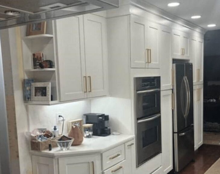
Tipton Gorman’s client had an enthusiastic request: a truly all white kitchen. Tipton Gorman made her client’s dream come true and gave the new space an elegant and transitional flare with white and off-white cabinets with gold-toned hardware from RiverRun Cabinetry. Read more about the project in Tipton Gorman’s words below.
Breezy-Tipton Gorman: “This was a repeat client that loved all things traditional with ivory, brown and beige. She wanted a truly all white kitchen including WHITE RHINO Marble throughout with Full High Backsplashes all the way up the wall and around the window, as well as a waterfall countertop end. We were on a budget and were able to reuse all of her existing appliances, same flooring, and much of the electrical lighting stayed applicable with a few upgrades.
We added permanent bench storage and an additional dry bar area that didn’t exist prior…Having the Navy cabinets in the laundry room and powder room, as a touch of Annapolis flare, in the home was a great compliment to the overall design.”
Judges’ Commentary
“Well executed.” – Shea Pumarejo
“Good stewardship of materials” – Sharon L. Sherman
Designer: Heather Pond, CMKBD of Classic Kitchens & Interiors
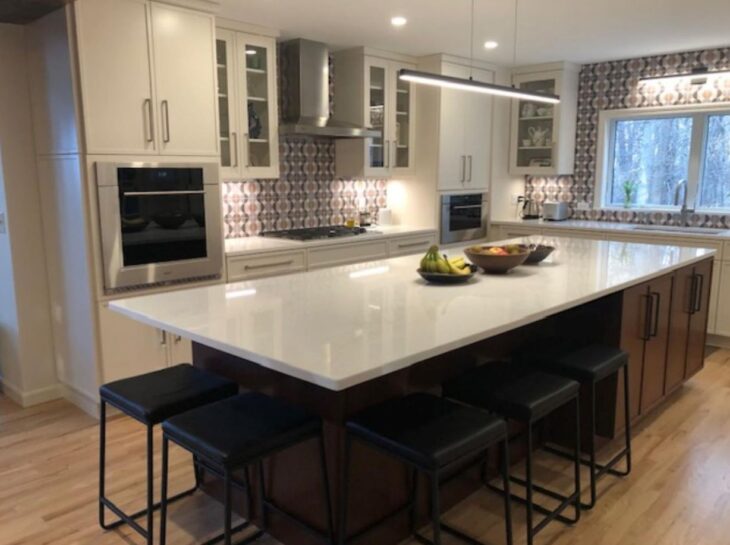
Heather Pond’s new project had significant layout challenges. Her clients wanted to optimize space while positioning appliances like the oven in a convenient, natural way. Pond got creative with space and was able to create a glamorous and functional kitchen with newly accessible views of Cape Cod Bay. Helping her achieve her clients’ vision were black and white cabinets from Corsi Group, Inc.
Pond: “This kitchen had off-set windows, a structural post impeding the view, an awkward layout, and a large closet that didn’t serve a purpose. I started by centering the new windows and removing the closet. However, the biggest challenge was to give the clients the built-in oven and separate speed oven they wanted installed at eye-height, and not mounted over each other.
To make this work, I had two 27” x 27” walls built in the corners to allow me to attach the tall cabinets without making the corners feel crowded or awkward. The new walls helped create three specific areas – one for cooking, one for clean-up, and one for refrigeration and storage. Removing the post required a structural engineer, but it opened up the beautiful views to Cape Cod Bay. I rotated the island, and made it much larger (approx 11’ X 4’), so that my customers could take advantage of the views while seated, as well as have an amazing prep and storage space.”
Judges’ Commentary
“This was truly a well thought out and executed design. Beautiful aesthetic and function was not sacrificed to form. Well done.” – Sharon L. Sherman
“Vast improvement! Much better use of space. Backsplash choice ties it all together. Sophisticated.” – Jenny Provost
Designer: Denise Merbeth, AKBD of Denise Merbeth LLC Kitchen & Bath Design
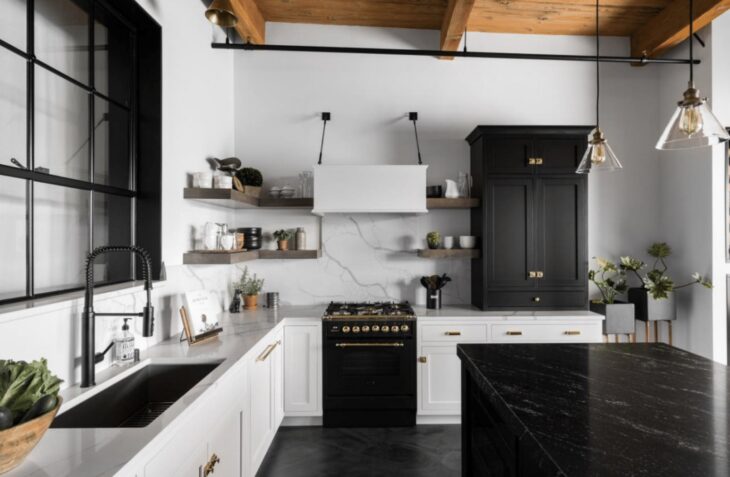
Merbeth’s clients wanted an elegant kitchen remodel with an English country aesthetic. She delivered with black and white cabinets from the Corsi Group, which were combined during fabrication to ensure that the design was smooth, elegant and uninterrupted. Gold trim and natural wood accents provided the kitchen with additional charm and classic beauty.
Merbeth: “Our goal was to blend the industrial elements of the space with an English country cabinet style the homeowner appreciates. Inset cabinets and classic latches were selected for the classic English aesthetic, while a custom hood with handmade steel support rods sourced by the homeowner lends an industrial touch. To achieve a seamless look, cabinets were combined during fabrication whenever possible.”
Judges’ Commentary
“This kitchen is alive with wonderful small details. Somehow the whole is greater than the sum of its parts! I like everything about this kitchen.” – Lance Stratton
“Design maintains nice blend of industrial with modern.” – Amy A. Wittenbach
Designer: Lynn Schrage
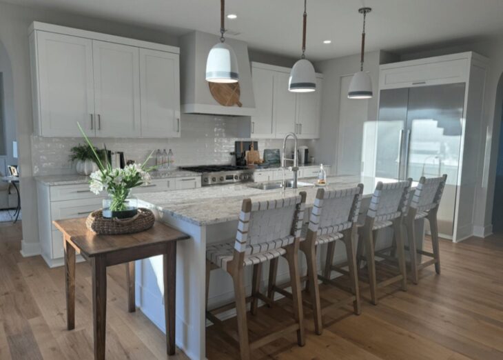
Schrage’s clients wanted a simple but elegant and functional space where they could entertain guests while enjoying the beauty of their island home. Schrage fulfilled their wishes with white cabinets from Corsi Group, Inc, creating an oasis that embodies soft coastal elegance and charm.
Schrage: “These homeowners were looking for a kitchen that embodies coastal charm, creating an inviting space for casual entertaining centered around a spacious island. The angled pantry was converted into a corner pantry with a pocket door, enabling the expansion of the L-shaped cabinetry footprint. This adjustment created easy access to bulk pantry items and incorporated a microwave on a pantry shelf… Designed with simplicity in mind, this kitchen layout fulfills the cook’s dream, featuring a generous ten-foot island for both prepping and entertaining.”
Judges’ Commentary
Beautiful details which capture the design intent.” – Sharon L. Sherman
“Smart design and use of space, well done!” – Amy A. Wittenbach
Designer: Amanda Mellace
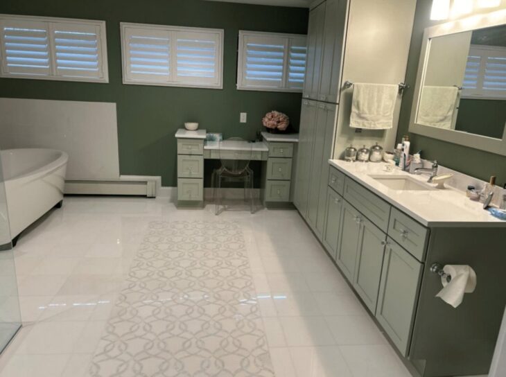
As the contest’s only bathroom remodel submission, Mellace’s project oozes sophistication with eye-catching mint green cabinets from RiverRun Cabinetry. The refresh gave the space a spa-like feel and an earthy, rejuvenating atmosphere.
Mellace: “Our challenge was to transform the homeowners’ outdated traditional bathroom with a more modern, refreshing, spa like bathroom. We wanted to open the area up making it feel light and airy, not as ornate as it was. The Mint green paint was the perfect shade to achieve this look. Paired with the Parkview door style the room looks refreshing, sleek, and clean just like we wanted.”
Judges’ Commentary
“Lovely use of color. Definitely has a spa like feel.” – Sharon L. Sherman
“I loved the curbless shower. Beautifully executed” – Shea Pumarejo
Designer: Madison Jackson, CKBD
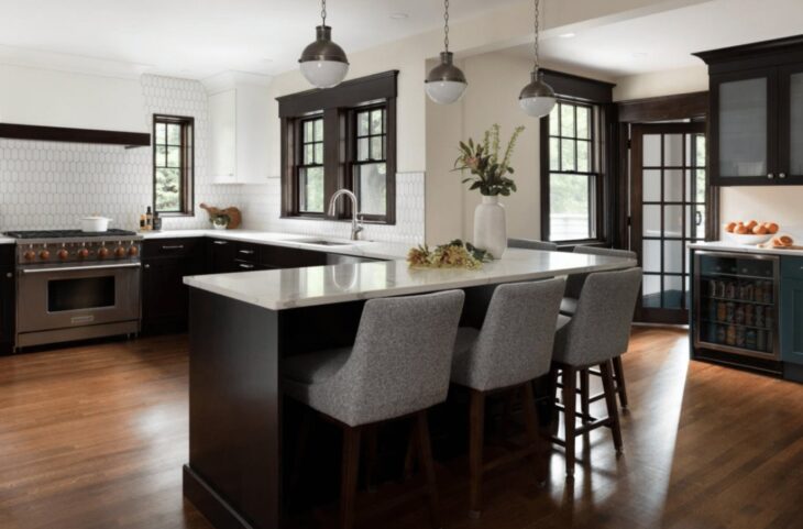
Madison Jackson transformed a dated 1920s New England style kitchen with a difficult layout into a sophisticated haven with gorgeous blue, black and white cabinets from Corsi Group. A reconfigured layout and careful selection of materials gave the space the charm and practicality the homeowners were searching for.
Jackson: “This project was on a 1920s New England Arts & Crafts style home with a dated kitchen, and a layout that wasn’t conducive to the modern lifestyle of a family of five. The solution included absorbing the footprint of the original butler’s pantry, former kitchen table nook, and moving the core of the kitchen to a new location. We forewent the kitchen table in favor of enough counter seating for the whole family, and added both a baking station and dry bar for targeted functionality outside of the main kitchen workspace. The revised layout was complimented by selecting a palette of materials that were true to the spirit of the home, and complemented the extensive existing woodwork.”
Judges’ Commentary
“Amazing transformation! Well organized and crisp, neat finishes. The richness of the cabinet and millwork finishes contrasting with the light tile and counters is just lovely.” – Jenny Provost
“Renovation created a serene environment with a sophisticated balance of materials.” – Gary Jay Paul
Congratulations to all of the distinguished designers in this year’s competition! To learn more about the contest, please go to www.kcmadesignawards.com. To learn more about the KCMA, please visit www.kcma.org.
About KCMA
The Kitchen Cabinet Manufacturers Association (KCMA) is a non-profit organization founded in 1955 to represent companies who manufacture cabinets, bath cabinets, or other residential cabinets and key kitchen and bath industry suppliers.
With a membership of almost 300 companies throughout North America, KCMA works to advance the cabinet industry through advocacy, setting cabinet quality standards, sponsoring kitchen and bath cabinet-related research and providing the cabinet industry with management tools and educational programs to grow their business.